The Problem
Homeowners financing energy renovations faced opacity around subsidies and loans. They couldn't understand what they'd pay monthly, when subsidies would arrive, or how MaPrimeRénov worked. The government portal (ANAH) required 13 steps but couldn't be embedded, and users frequently made errors that blocked approval. Abrico needed a way to make complex financing legible and guide users through external administrative processes.
Mission Goals
Abrico hired me to make their complex financing product understandable for non-technical homeowners while serving the operational needs of contractors. My goal was to design interfaces that explained how subsidies and loans work together, guided users through external government processes they had to complete on their own, and gave each stakeholder the right level of control without overwhelming them with unnecessary complexity.
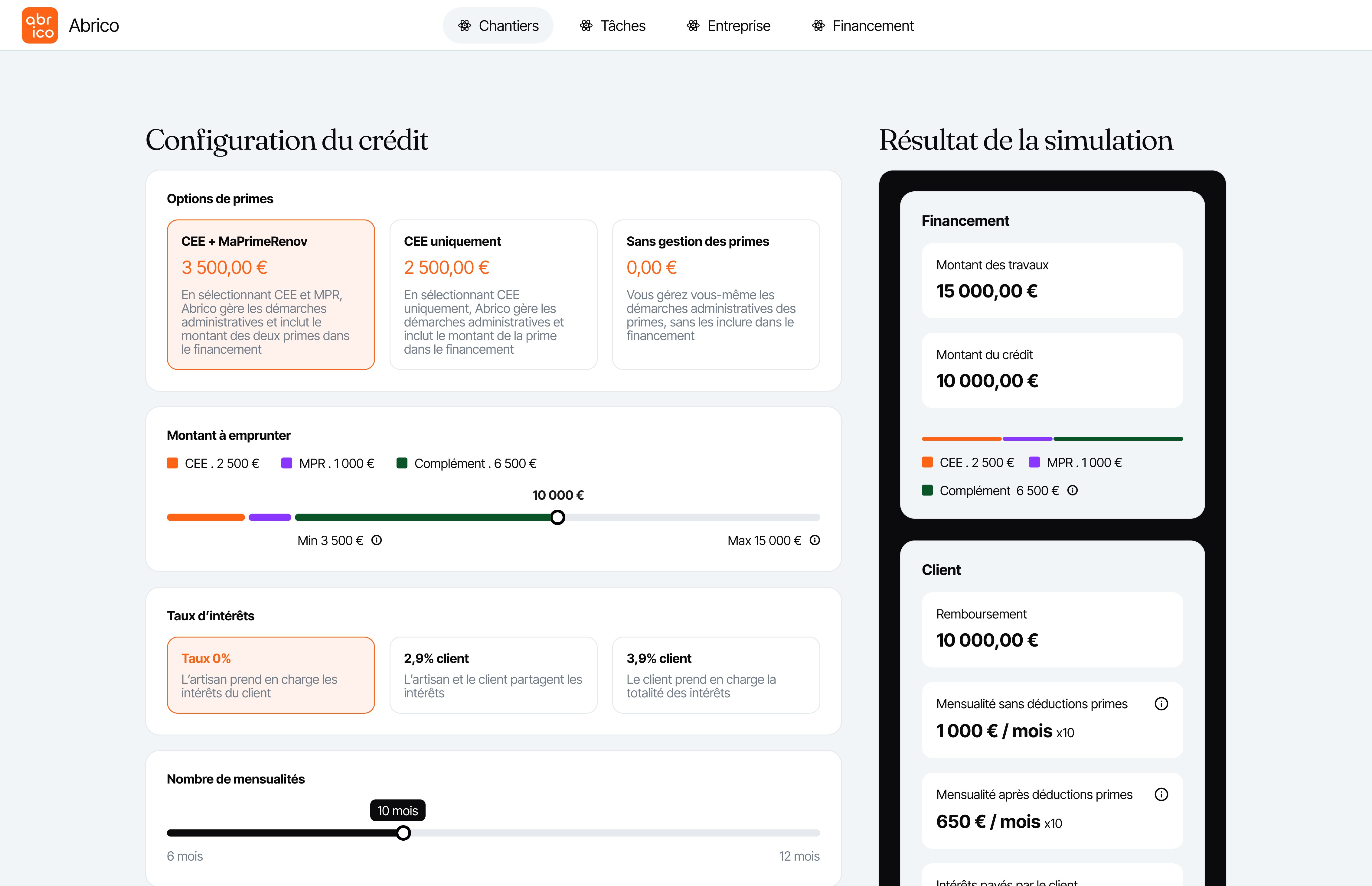
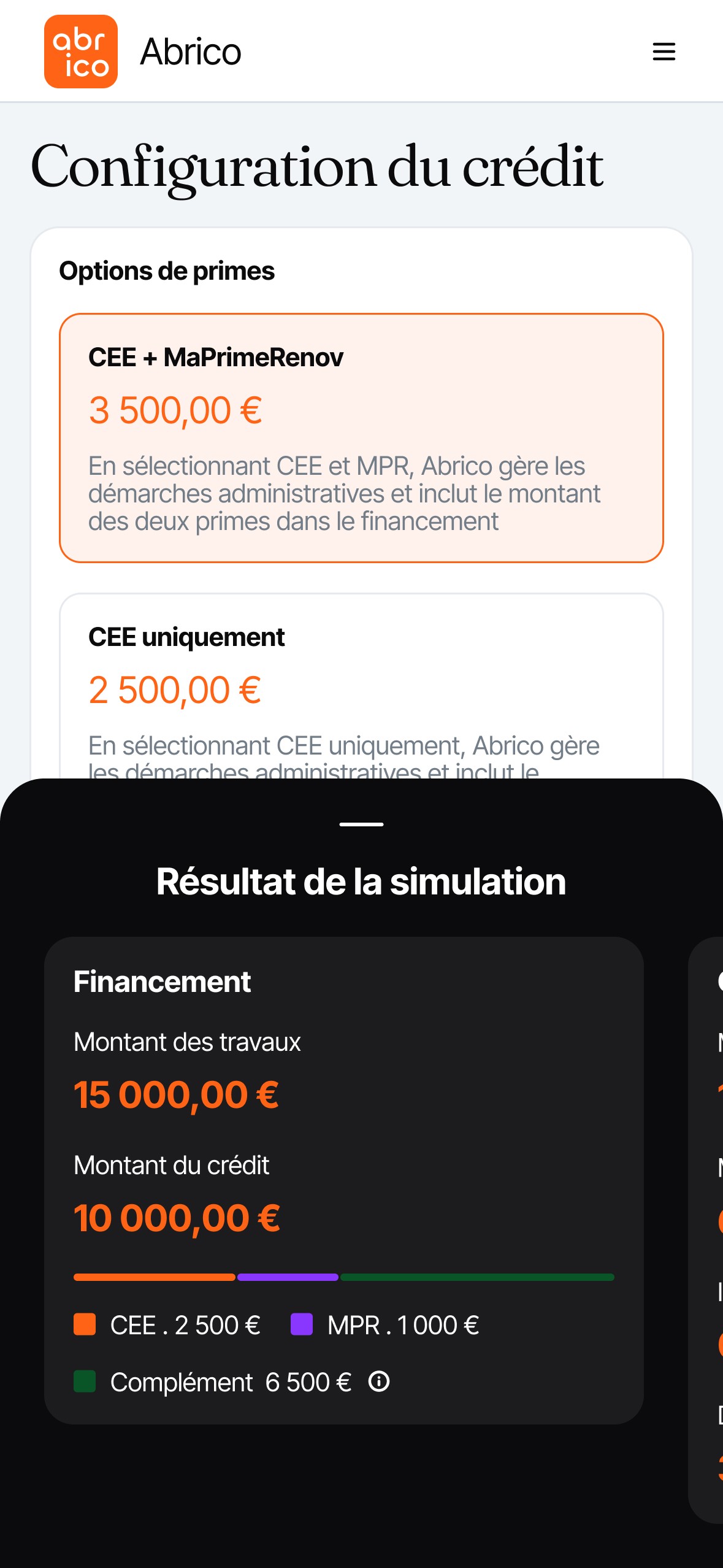
I designed a step-by-step flow that explains the financial mechanics and makes trade-offs visible. The financing interface guides beneficiaries through understanding subsidies, comparing payment scenarios, and configuring their loan parameters.
Desktop: Financing plan overview
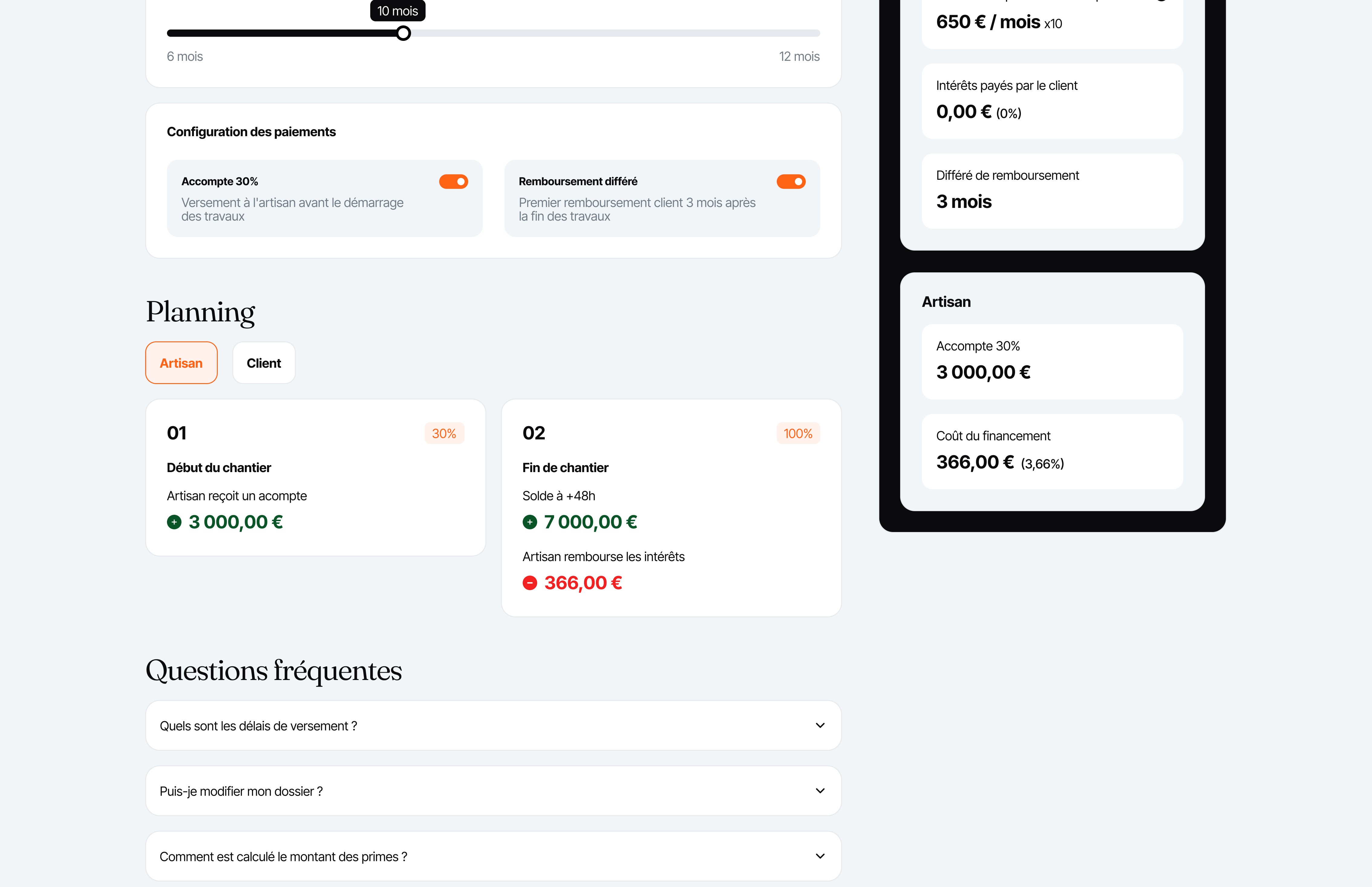
The desktop plan provides the complete financing plan, showing subsidies, loan configuration, and the full payment schedule with side-by-side comparison for contractor and client.
The timeline view shows when each payment and subsidy is scheduled, with different perspectives for contractor and client.
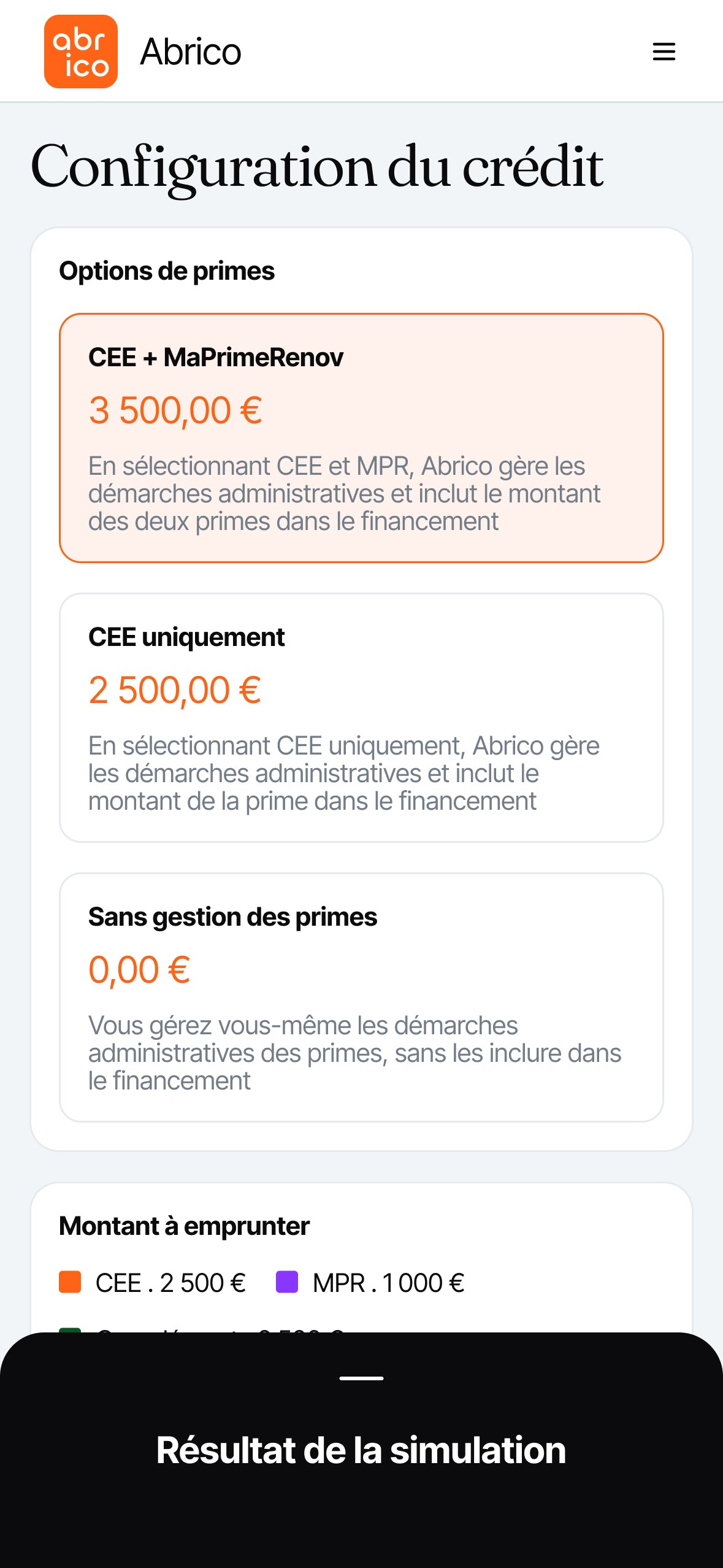
Mobile: Bottom sheet interaction
On mobile, the financing plan surfaces as a bottom sheet. Users can view a summary or a detailed breakdown in a separate sheet for ease with tall payment scenarios.
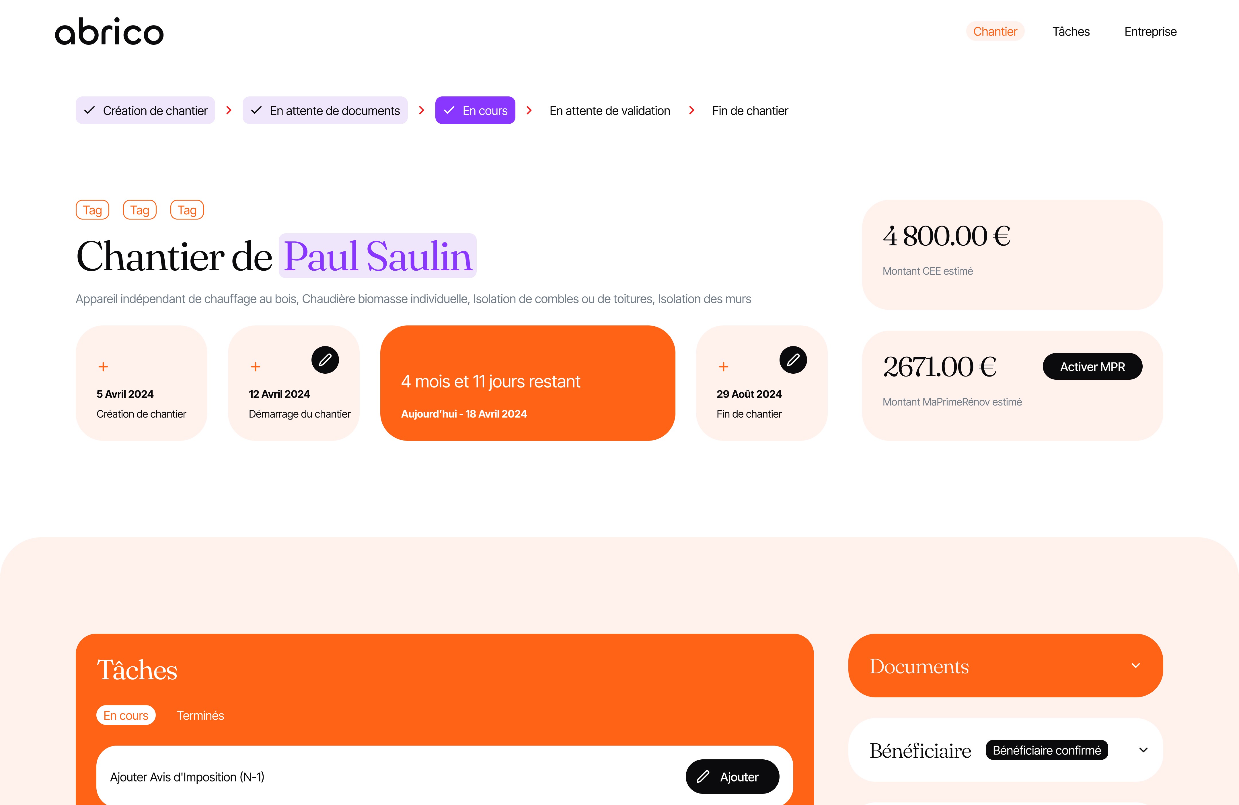
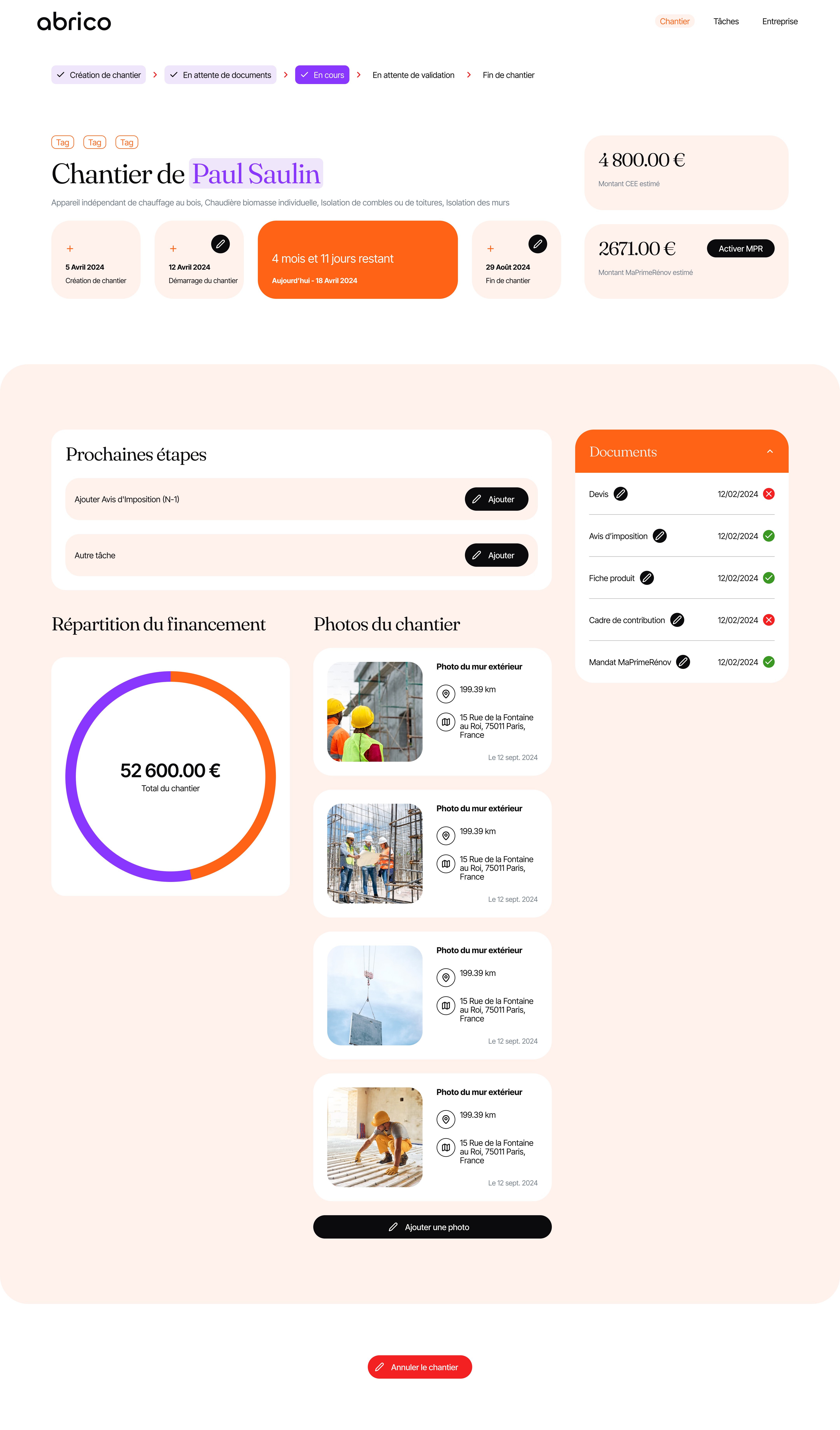
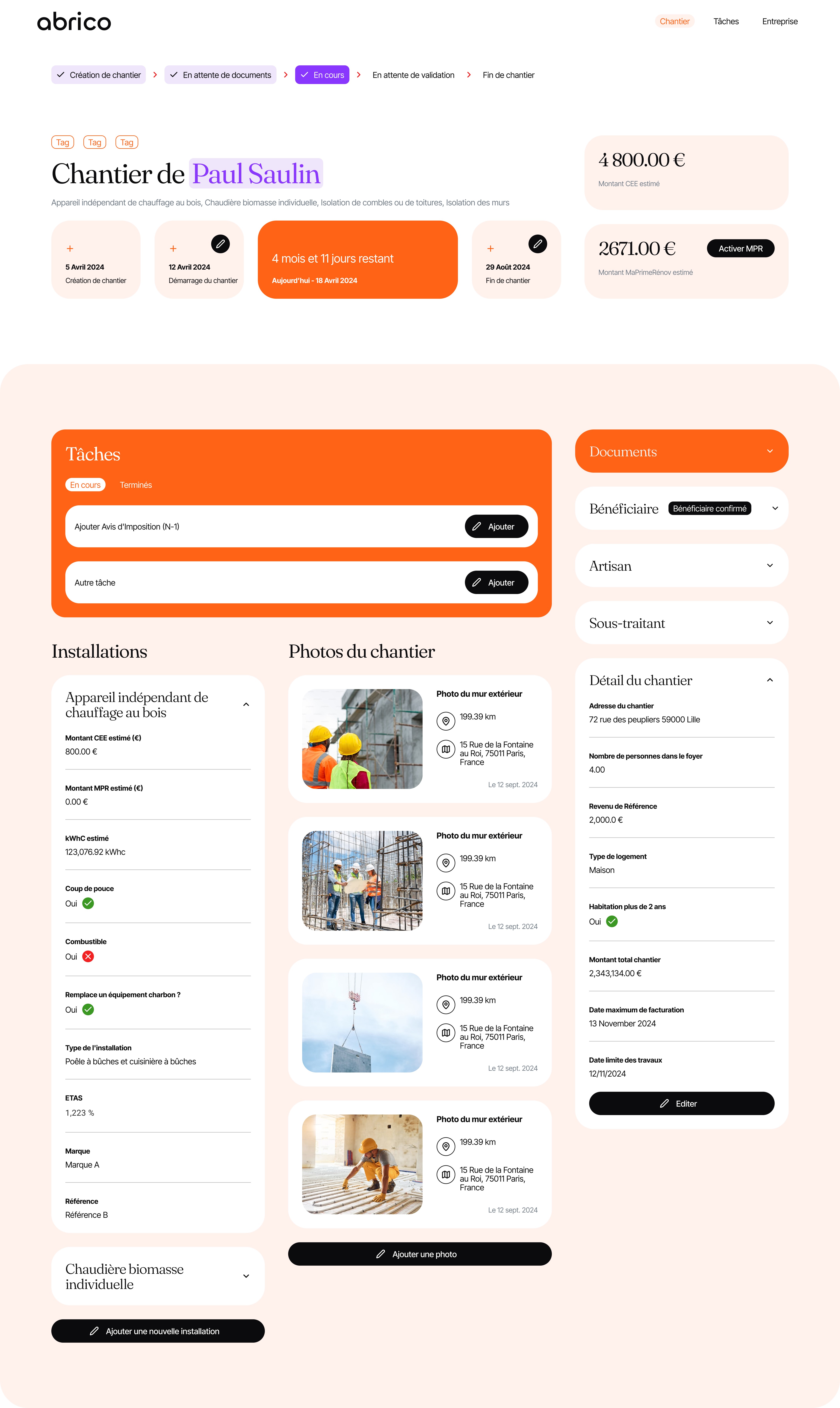
Beyond financing, I designed a renovation project dashboard that supports the entire project lifecycle while serving project roles differently (beneficiary vs contractor). The interface guides beneficiaries to upload required materials and progress tracking while giving contractors operational control for managing tasks, documents, and project details.
Beneficiary view: Clear steps and document checklist
The beneficiary dashboard focused on next-step clarity. Users see exactly what they need to do (document uploads, photo uploads) and what's coming next in the project timeline without being overwhelmed by operational details.
Key elements:
Next steps and document checklist
Progress tracking and timeline
Subsidy status and activation
Photo evidence capture
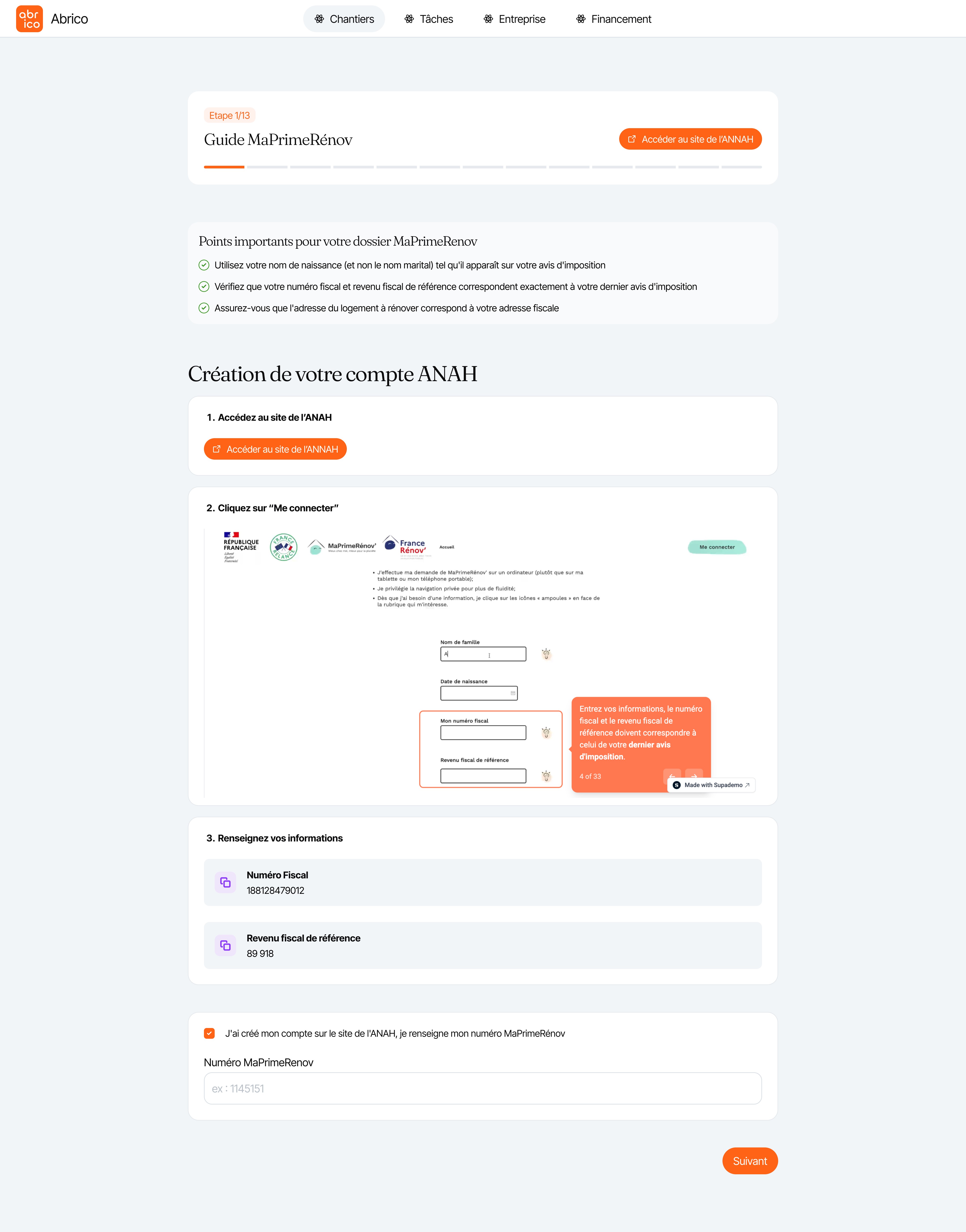
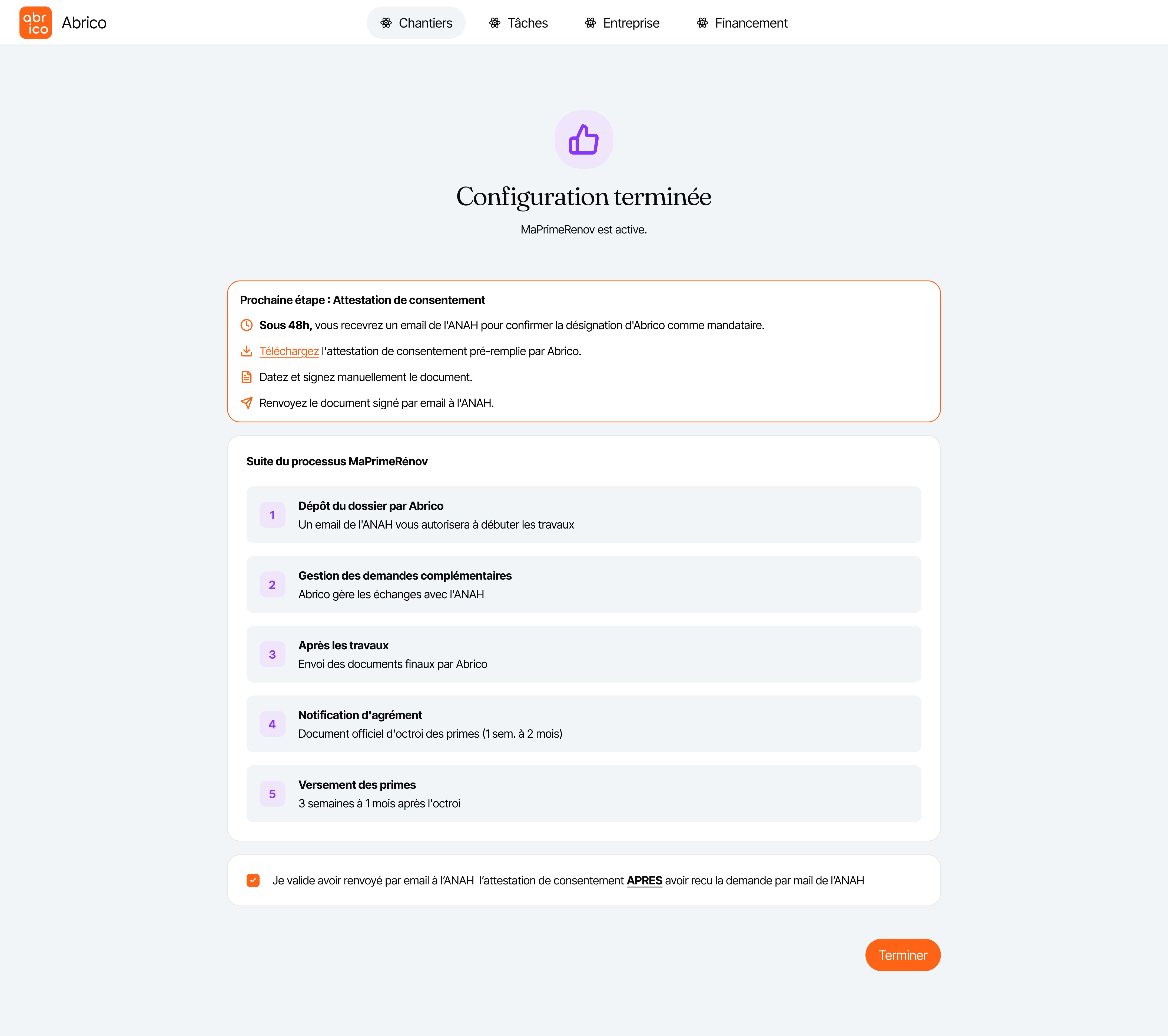
The platform also included beneficiary onboarding (capturing personal info and tax documents to reduce back-and-forth) and a 13-step MaPrimeRénov' guide that helped users navigate the external ANAH portal with error prevention and progress tracking.
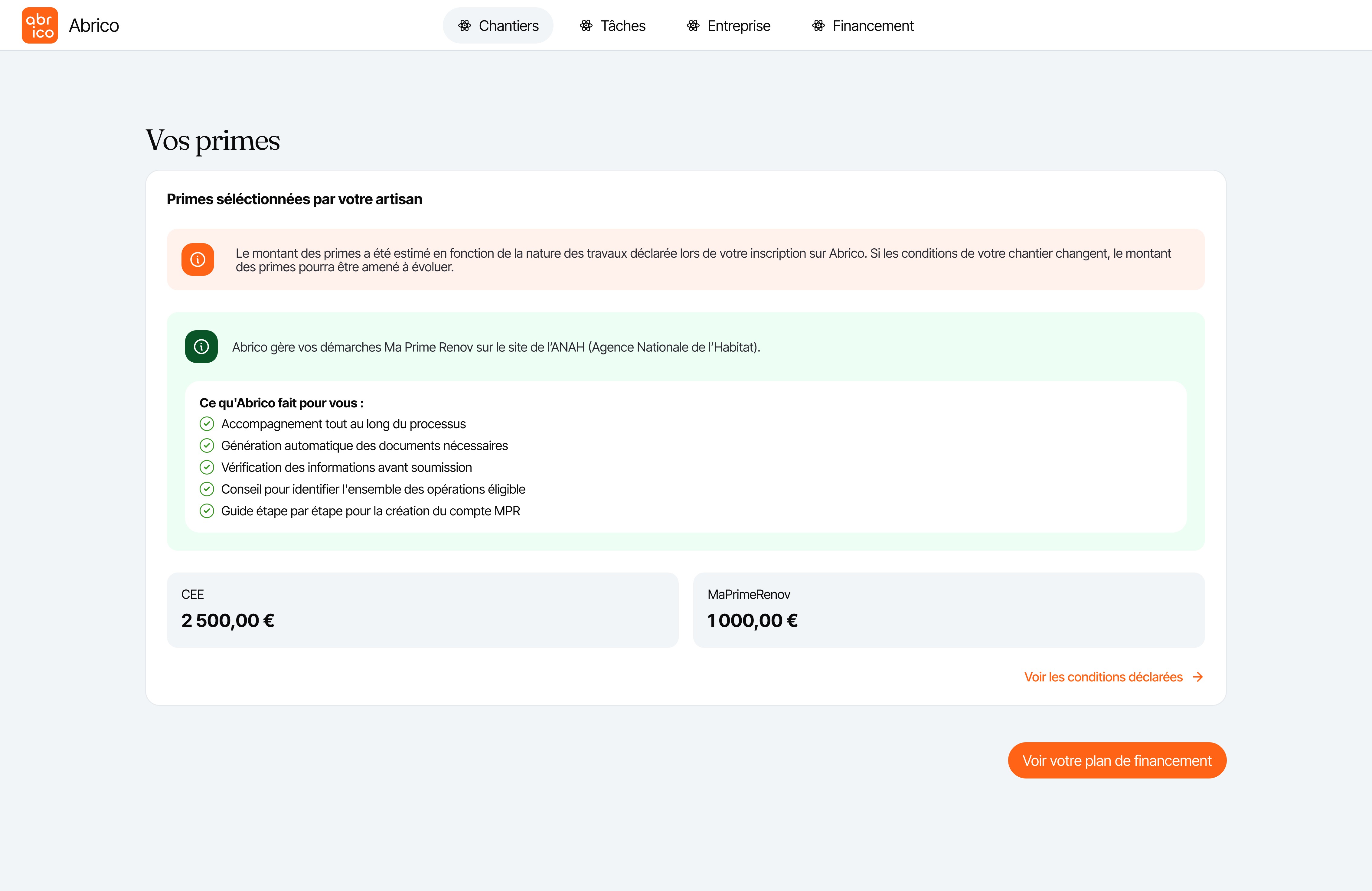
The financing flow was designed to reduce confusion: every trade-off was made explicit, and the beneficiaries compared the impact of subsidy choices, loan terms, and deferral options before committing. The side-by-side planning view (contractor vs beneficiary) helped align expectations and reduced support questions.
When ANAH introduced the "Voted" budget column mid-project, the guidance system was used. The work successfully addressed technical constraints (Glide's no-code limitations) while making a genuinely complex financial product feel approachable for non-technical users.
The work taught me how to design within system flows—beneficiaries often relied behind, forcing us to design "nudge" mechanisms (clear next-step CTAs and document checklists) to keep projects moving. It also reinforced that explaining payment scenarios upfront builds trust even when monthly amounts seem higher.
Working within Glide showed that flexible design decisions were shaped by tool limits, and creativity often came from rethinking flows entirely (like the bottom-sheet mobile pattern) rather than fighting constraints.